
In this article I will attempt to illustrate some of the pitfalls of thinking about down-scaling in the spatial domain, and highlight the benefits of thinking about it in the frequency domain. I will attempt to keep it free of maths, and instead concentrate on practical examples.

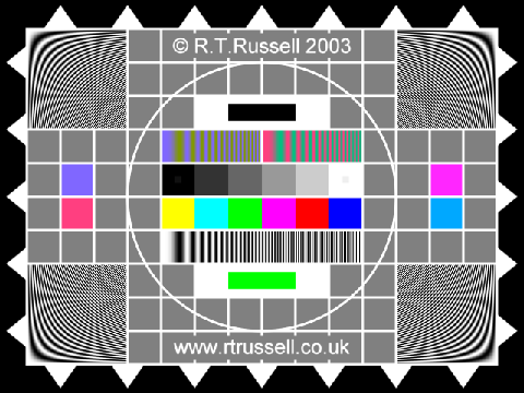
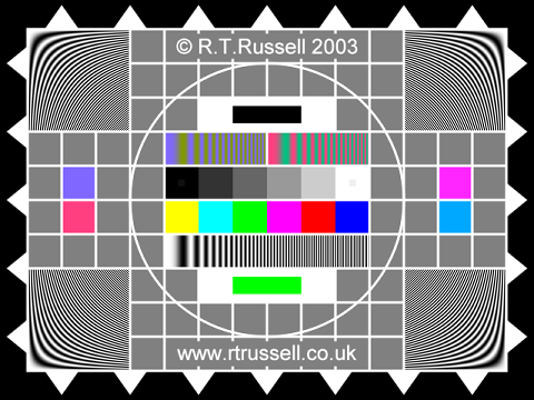
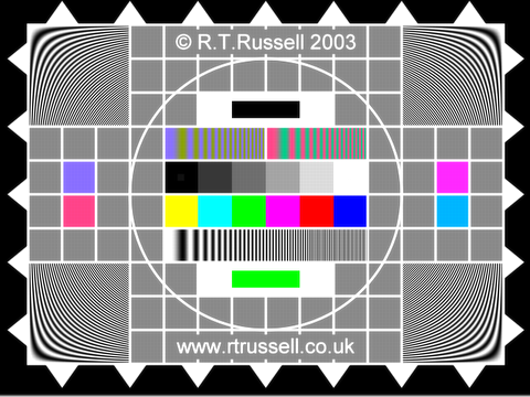
This image has a number of features that make it particularly suitable for evaluating scaling performance, for example the hyperbolic zone plates at the corners and the frequency sweep just below the centre. That frequency sweep extends from zero frequency (DC) on the left to the maximum possible horizontal frequency (320 cycles-per-picture-width) on the right. The image will also be testing of your PC display, so if you see any dark bands or other strange effects towards the right-hand end of the frequency sweep, or in the zone plates, bear in mind that they're not really there!
Now we can get to the heart of what this article is all about, and because it's so important I'm going to put it in a box:
|
We know that, in the case of this example, the source image contains horizontal frequencies up to 320
cycles-per-picture-width, yet the scaled-down output image can only contain horizontal frequencies
up to 240 cycles-per-picture-width. What, then, happens to those high-frequency components in the
original image? The answer is that they must either be removed (i.e. attenuated) by the down-scaling
process, or they get converted to aliases in the output image. In this context an alias is rather
like a reflection: for example a frequency of 300 cycles in the source image – 60 cycles higher than the
Nyquist Limit for the output image – will (if not removed) become an alias frequency of 180 cycles –
60 cycles lower than the Nyquist Limit. You will see later what aliases look like, but suffice it to say that
they are not desirable!
Many down-scaling algorithms do not take account of the necessity to remove spectral components that cannot be carried in the output image, and therefore they suffer from aliasing. This article will demonstrate that, by thinking about the problem in the frequency domain, this aliasing can be avoided (or at least reduced). |
Let's analyse in a little more detail what's involved with down-scaling the image from 640 pixels across to 480 pixels across. For every eight samples in the input image we need to create six samples in the output image; that can be visualised as follows:
| Input: | a-----b-----c-----d-----e-----f-----g-----h |
| Output: | -A-------B-------C-------D-------E-------F- |
Here a, b, c, d, e, f, g, h represent 8 input samples, and A, B, C, D, E, F represent 6 output samples. Note the relative positions of the samples: none of the output samples is at the same position in the image as an input sample. This ensures that the output image is correctly centered with respect to the input image (some scaling algorithms may get this wrong).
Output samples B and E are actually positioned exactly half-way between two input samples, so here I have arbitrarily set them equal to the input sample to their left. You may guess that such a simple algorithm doesn't give very good results, and you would be right! Here is the output image:A = a B = b C = d D = e E = f F = h
| Input: | a-----b-----c-----d-----e-----f-----g-----h |
| Output: | -A-------B-------C-------D-------E-------F- |
The values of the output samples are calculated as follows:
The output image is as follows:A = a*0.833333 + b*0.166667 B = b*0.500000 + c*0.500000 C = c*0.166667 + d*0.833333 D = e*0.833333 + f*0.166667 E = f*0.500000 + g*0.500000 F = g*0.166667 + h*0.833333
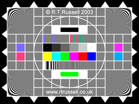
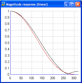
This is certainly a big improvement, but there are still problems. The zone plates in the corners are covered in dark bands which shouldn't be there, and the right-hand (high frequency) end of the frequency sweep is a real mess.
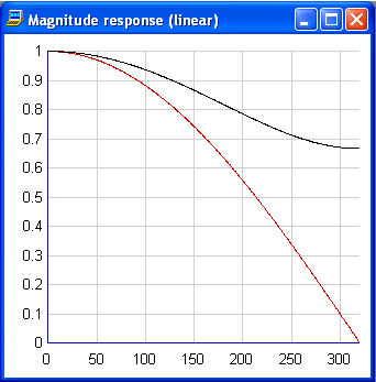
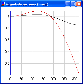
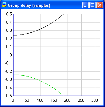
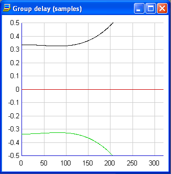
Let's think a bit more deeply about why it isn't very good. The averaging processes represented by the above equations can be thought of as filters, in fact they're a special class of filter called a Finite Impulse Response filter (FIR). Such filters can be analysed in the frequency domain to reveal information about why the output image isn't as good as it could be. In particular one can consider how the magnitude response and the group delay response of the filters vary with frequency:
 |
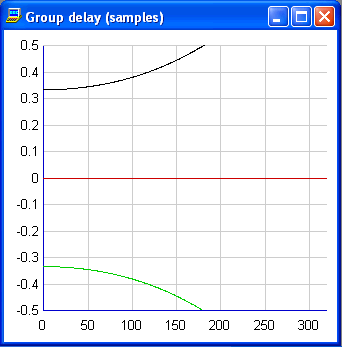 |
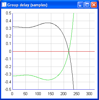
You will note that in this particular example there are only three different filters used for the down-sampling process (the filter for sample A is the same as the filter for D, that for B is the same as that for E, and that for C is the same as that for F). Those three filters are represented in the graphs above in black, red and green; in the left-hand graph the green curve is covered by the black curve. The horizontal axis in each case is frequency, in cycles-per-picture-width.
What exactly are these graphs telling us? We know that frequencies in excess of 240 cycles cannot be represented in the output image, and if not attenuated will result in aliasing. You can see that one of the filters (the red curve) does a reasonable job of attenuating those frequencies - its response is down to about 0.4 at 240 cycles. However the other two filters (the black and the green) do not attenuate the high frequencies very much. This immediately tells us that aliasing is likely to be a problem; something that wouldn't be apparent without analysing the process in the frequency domain.
The group delay graph tells us about how accurately the output samples are positioned. This will probably not be obvious, but the effective position of the output samples with respect to the input samples depends on the frequency of the signal (at least, it does for the black and green filters). At DC the samples are correctly positioned at half-way between the input samples (red curve), one-third of a sample to the left of that position (green curve) and one-third of a sample to the right of that position (black curve). However at higher frequencies the upper and lower curves diverge from the wanted ± one-third positions. This will impair the quality of the image.
| Input: | a-----b-----c-----d-----e-----f-----g-----h |
| Output: | -A-------B-------C-------D-------E-------F- |
Cubic interpolation operates on the principle of fitting a set of cubic polynomials to the input samples, such that the result is a continuous smooth curve. The output sample values can be 'read off' the curve where it crosses their positions in the image. The result in this case is that the output samples are calculated as follows:
Because each output sample is derived from four consecutive input samples we can't show the equations for samples A and F, but in just the same way as equation B has the same coefficients as equation E, equation A is the same as equation D and equation F is the same as equation C. In fact, when down-sampling in the ratio 4:3 there can only ever be three different sets of coefficients.B = a*-0.125000 + b*0.625000 + c*0.625000 + d*-0.125000 C = b*-0.023148 + c*0.189815 + d*0.949074 + e*-0.115741 D = d*-0.115741 + e*0.949074 + f*0.189815 + g*-0.023148 E = e*-0.125000 + f*0.625000 + g*0.625000 + h*-0.125000
The resulting image is as follows:
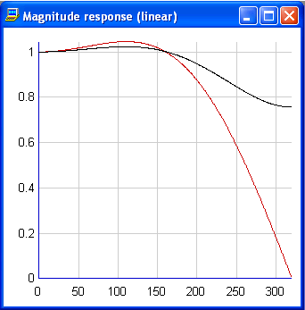
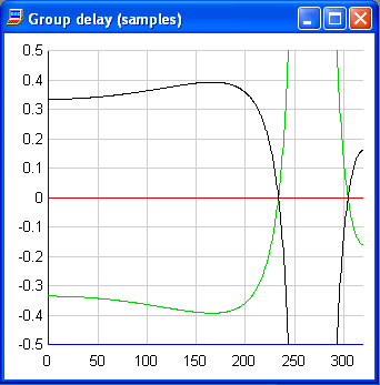
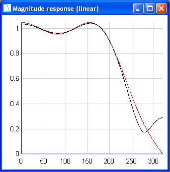
A bit better perhaps, but still not perfect and the right-hand end of the frequency sweep still looks a mess. Perhaps analysing this method of interpolation in terms of filter responses will tell us why:
 |
 |
This is interesting. Looking at the magnitude curve we can see that the response is maintained closer to 1.0 than the previous method, in fact over much of the range it is greater than 1.0. This explains why an image generated by cubic interpolation can look nice and sharp. However it is even worse than the two-point average filter in attenuating those high frequencies that cause aliases, so it's not surprising the high-frequency end of the frequency sweep is still a mess.
The group delay curve is revealing, because at low frequencies the output sample positions are less accurate than those of the averaging filter, at approximately ± ¼ a sample rather than the correct value of ± one-third a sample. As the frequency increases the positions become more accurate, approaching the correct values at about 110 cycles; above that they diverge. Again, this is hardly ideal.
FIR filter synthesis is a complicated subject, and it is beyond the scope of this article to explain how it is done. Suffice it to say that there are various algorithms (a well-known one being the Parks-McClellan algorithm) which can synthesise optimum filters against a set of criteria. Just such a set of filters for the present application is as follows:
The filter response curves are as follows:B = a*-0.103516 + b*0.603516 + c*0.603516 + d*-0.103516 C = b*-0.045105 + c*0.187988 + d*0.923279 + e*-0.066182 D = d*-0.066182 + e*0.923279 + f*0.187988 + g*-0.045105 E = e*-0.103516 + f*0.603516 + g*0.603516 + h*-0.103516
 |
 |
Not dramatically different, to be sure, but the magnitude response is slightly flatter than the cubic and the delay response is significantly closer to the ideal than any of the previous efforts. The resulting image is as follows (it's hard to see the differences from the last one, but it is a little better):

So if reducing aliasing is the primary requirement, an alternative set of synthesised FIR filters is as follows:
Which give rise to the following response curves:B = a*0.122803 + b*0.377197 + c*0.377197 + d*0.122803 C = b*0.037048 + c*0.308289 + d*0.437622 + e*0.217041 D = d*0.217041 + e*0.437622 + f*0.308289 + g*0.037048 E = e*0.122803 + f*0.377197 + g*0.377197 + h*0.122803
 |
 |
Here we've managed to attenuate those frequencies which would cause aliasing (above 240 cycles) to well below a magnitude of 0.1, but of course the price we pay is in the sharpness of the resulting image:

Here are the results from some filters synthesised with eight coefficients:
 |
 |
Here you can see that the right-hand end of the frequency sweep has been significantly attenuated. Of course if you want to do even better you can synthesise filters with even more taps, at the cost of increased processing time. It's not unusual to use filters with 16 taps or more in critical applications, such as broadcast television.